What are zones used for?
Zones are spaces used to hold your content together on your website. Once you have placed your content in these areas, it will be much easier for you to edit your content. You can edit these zones or completely remove them with a single click. It will also be much simpler for you to edit or change your backgrounds since once your website is divided into zones, you can easily manage your backgrounds from each area independently and put them full width (by checking the option in panel "background" editing box). One thing’s for sure, they will greatly help increase the professional look of your website, as well as its clarity. If you are still struggling with zone management, you can check out our help page.

How to use zones?
True to the rest of its editor, adding zones to your website is very simple. Once you are in the editor of the page you want to edit, just click on "add", and at the bottom of the menu where you will find the "zones" feature. Then you simply drag the area and drop it where you want to add it. You will see it appear immediately; it’s child's play!
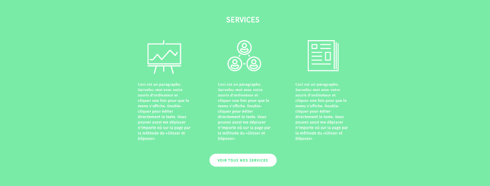
Once added to your website, it is ready to hold your content. Add icons and paragraphs to transform it into an “information” zone, or a catchy phrase and a "call-to-action" button to encourage your visitors to visit another page on your website. You want to imitate the parallax effect? Just add a nice photo as a background, and make it static. Your background won’t move while the rest of your content scrolls, which will give a parallax effect to your website.
Your idea deserves a great site! Start creating your website today!