What is a contrast of color exactly?
To begin with, let us take a moment to explain what color contrast is. According to its definition, a contrast is the juxtaposition of opposing colors, forms, lines, etc. to create an intense visual effect. In other words, it is using two very different elements that bring something more to the overhaul result. The most common example is using black and white. Contrasts are often used in design and websites.
Several online tools can help you check if the color contrast is sufficient. It is recommended to aim for a contrast ratio of more than 4,5.
Why use contrasts on your website?
But what are the advantages of using color contrasts on a website? Contrasts are more than just a trend; let us see this more closely.
To help with the reading
First, color contrasts can ease the reading of a text. Indeed, when we think about a book page, the fact that the text is written in black on a white background makes it easier to read. If you have a website or a blog, you must ensure that your visitors can read your texts easily. A way to achieve it is to have a sufficient color contrast; it is not mandatory to use black and white.
To promote some specific elements
Color contrast can also be used to catch the visitor’s attention on a specific element, like a special offer, a link, or a call-to-action button. For example, using a warm or bright color on a neutral background will increase the chances that your visitor will notice it. On the contrary, if there is no contrast, your visitor may find it challenging to see what they are looking for.
To add some vitality
In the same vein, color contrasts can bring a touch of vitality to your website. A good contrast draws attention and makes everything more memorable; it simply stands out. Since it is also an important trend in the design world, it can show that you are a modern business. Therefore, it should not be neglected.
Four types of color contrasts
Many color contrast options are possible; it all depends on your wanted style and color palette. Here are four color contrast combinations to consider when creating your website.
Black and white
First, the combination of black and white is quite a classic. There is no better contrast than these two colors. If you want to create a refined website, you could decide only to use black and white. Moreover, using black and white can also promote the other colors of your palette.
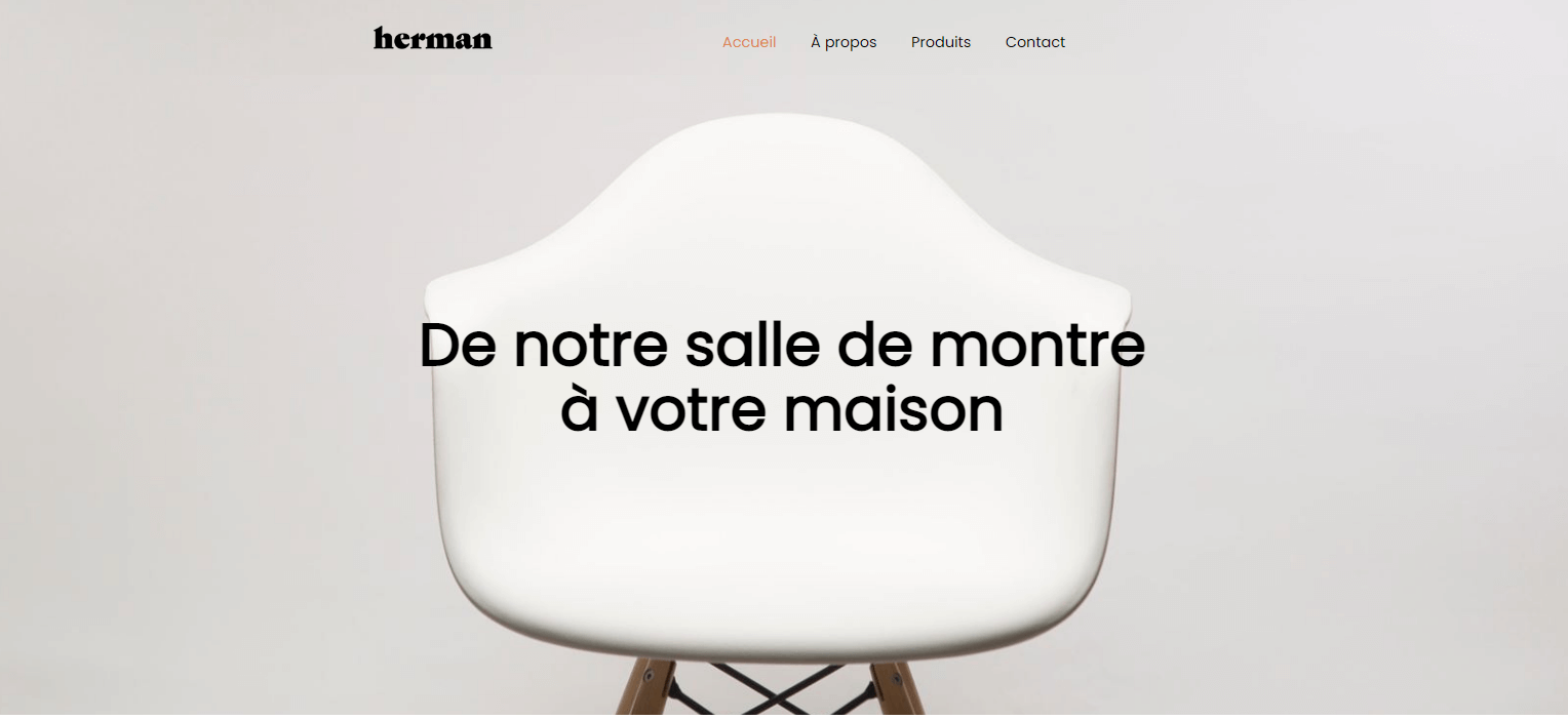
Using a white background on your site’s sections is not mandatory. Why not do the opposite and choose a black or dark background with white text?
Cold and warm colors
There is also the combination of cold and warm colors. Warm colors are made up of red, orange, and yellow; while cold colors are green, blue, and purple. Therefore, it is a contrast when we use a warm color with a cold color.
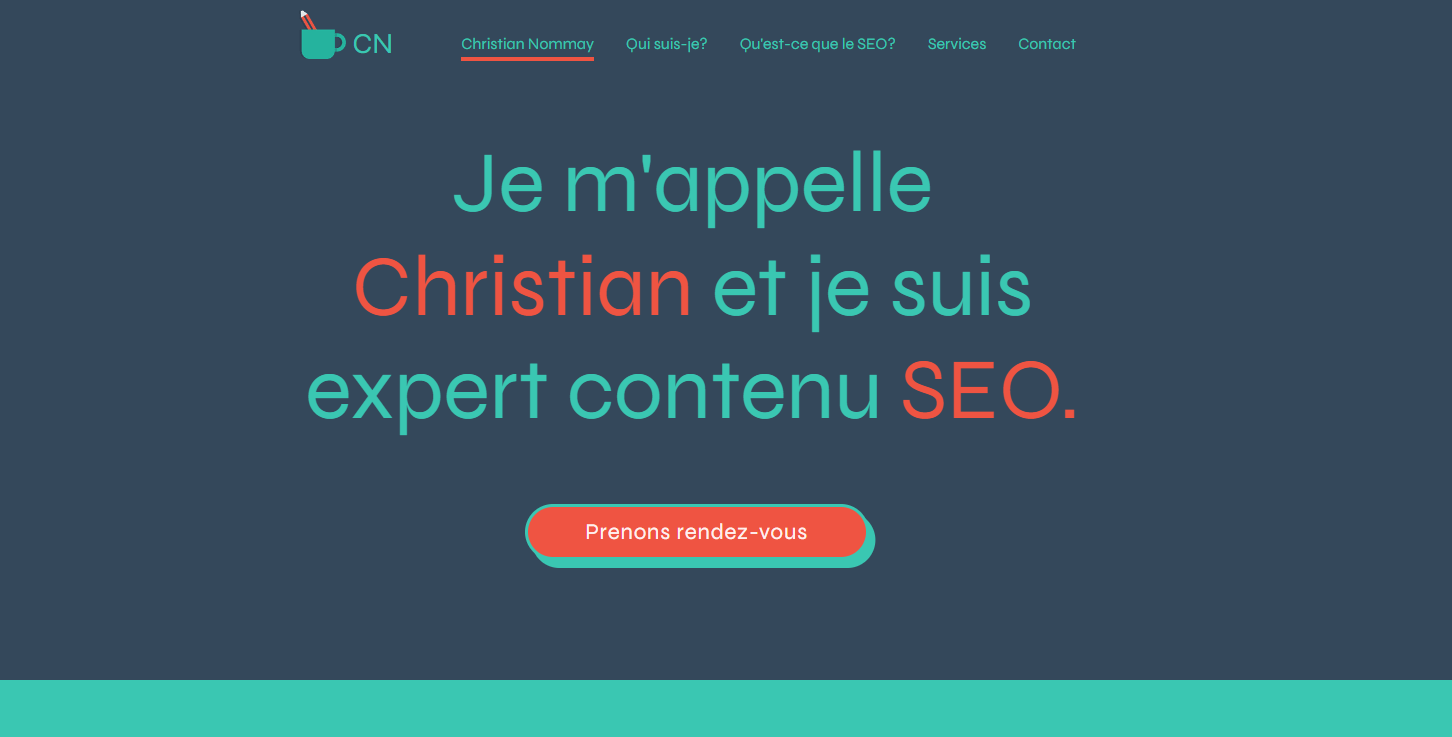
Let us think about using red and blue together. Since they are two different colors, it can create a dynamic effect.
Pale and dark colors
You may want to use a precise color on your website. If you do not want to use a complementary color to create a contrast, you could use a paler or darker hue. Color palettes are precisely made up of several lighter and darker shades to meet different needs.
For example, if your primary color is blue, you could use baby blue for some elements and a darker blue for the background.
Complementary colors
Complementary colors are located on the opposite sides of a color circle. They are like opposite colors. Besides bringing great contrast, they draw attention. Red and green, yellow and purple, and orange and blue are complementary colors.
It is unnecessary to overuse the same two complementary colors on your website. Start by using your primary color and then use its complementary color for the accents and elements that needs to stand out.
In conclusion, there are several benefits to using color contrasts on your website. There are also many ways to proceed. Keep this in mind when you create your color palette. You need paler and darker colors that can be used on your site. In addition, please note that it is possible to create contrasts with fonts. Find our best tips on this topic in our Typography 101 article. Good luck!