Why use a color palette on your website?
In another article, we explained how to use colors on your website. In sum, it is vital to have sufficient contrasts between the background and text colors to ease the readability and use colors that catch people’s attention quickly for important elements like titles or call-to-action buttons. Also, it is recommended not to use too many different colors if you do not want your website to look chaotic.
But what about the color palette? A color palette is a set of different colors. If you own a business, your brand image must include a color palette. Indeed, it is recommended to use the same brand colors, whether on your logo, website, or promotional items, so they can be easily associated with your business. Now, let us see how to create a color palette.
How to create a color palette
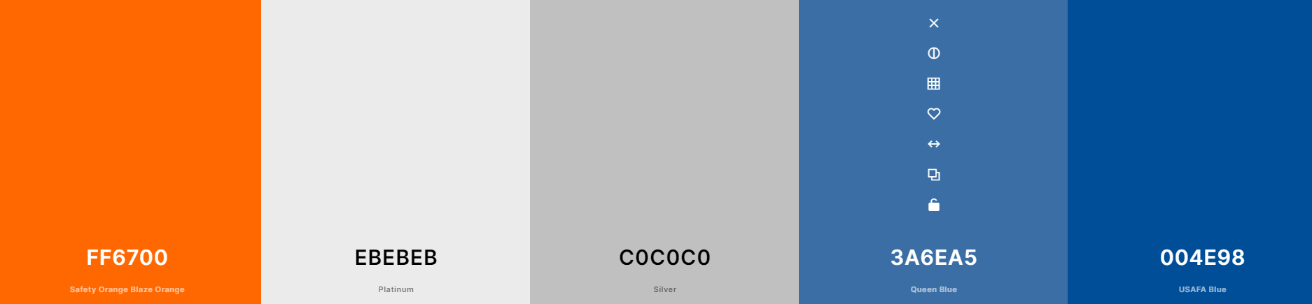
Most of the time, a color palette is made up of 5 different colors. Each color of your palette has a precise goal; this is why it is important to have an idea of the wanted look. For example, you can decide to use similar hues or complementary colors.
1-What would be the desired look?
Before choosing your colors, it is essential to ask yourself what is the desired look. What do you want your visitors to feel when they visit your website? Do you want it to be sophisticated, calming, or dynamic? What are your values, and who is your target audience? It would also be relevant to know the meaning of colors. Everyone knows that green is the color of nature, but did you know it is also the color of hope?
2-Choose the dominant color
Let us start with the most important color of your brand image, the dominant color. It is the primary color of your palette, which will be the most used on your visuals and website. For example, if we think about McDonald’s, we instantly think about red. On the contrary, if we think about Facebook, we know that blue is the dominant color of this business. Which color would represent your business and its values the best?
Regarding WebSelf, we decided to use turquoise blue as our dominant color for our palette. We use it everywhere.
3-Choose the secondary color
Let us now talk about the secondary color of your palette. As its name suggests, it is your brand's second most used color. You can choose a similar hue or something different, you decide. It could be interesting to select a secondary color that has great contrast with the dominant color. The secondary color needs to support the first one. Its meaning must also work well with your business values.
For example, if you make eco-friendly products for women and your dominant color is green, you could choose purple or pink as the secondary color.
4-Choose an accent color
The third color of your palette is the accent color. It is a hue that will stand out from the two other colors; its main purpose is to draw attention to some specific components of your website. For example, you could decide to use the accent color on call-to-action buttons or important titles. Consequently, remember that it is a color that will not be used a lot on your website.
An easy way to find an accent color for your palette is to use the complementary color of your dominant color. If blue is the dominant color of your palette, you could then use yellow or orange as an accent color. Use a color wheel if needed.
5-Choose the two other colors
It is now time to define the two last colors of your palette. At this step, ask yourself what is missing to have the desired effect with the selected hues. For example, you can choose neutral colors like grey, white, or black. It can be relevant for the texts or the background of the sections of your website. You can also decide to choose a declination of your dominant color. If your dominant color is bright red, you could decide to use something pinker or orange.
Try different options. When you have an interesting color palette, test it on your website to see if it works. Do not forget to have sufficient contrasts between the different colors of your palette to ensure your texts can be read easily.
A few tools to help you create a color palette
You might not know where to start or do not know which colors would work well together. No worries! Many online tools can help you create a color palette easily.
Coolors
Coolors is one of our favorite tools when it comes to creating a color palette. Indeed, in just a few clicks, you can access their color generator and many existing color palettes.
Adobe Colors
Adobe Colors is a more complex tool. Indeed, this tool will offer you different color combinations, whether it is with similar, monochrome, or complementary colors.
Pantone
If you are looking for trendy colors for your website's color palette, take a look at Pantone. Every year, this American business selects the color of the year. For example, Very-Peri, a metallic purple, is the color of 2022.
In conclusion, creating a color palette for your website is not too complicated. Start by asking yourself what effect you want for your site, inform yourself about the meaning of colors, and then choose the different hues. And when your color palette is ready, do not forget to note down all the color codes in your brand style guide.