Choosing the right fonts for your website
Let’s start by the beginning: you need to choose fonts to use on your website. Like colors, fonts are there to help you pass on a message or your values. You must then keep this in mind during the creation of your site. You might already have an idea of the style you want to use. You might even already have chosen fonts and added them to your brand guide. You might want to use the same font you used for your logo too.
It is vital that you always use the same fonts, whatever the medium, in order to keep a certain uniformity regarding the brand. For example, when possible, take the same fonts for your website, logo, social media posts, documents, or event flyers. Our suggestion is to try different fonts until you find the right ones.
Serif and sans serif fonts
Before we reveal our tips, let us present you with two font categories. Of course, there are many categories; however, serif and sans serif fonts are quite popular. They each have different advantages that you should know about.
First, serif fonts have been used for a long period of time. They are mainly used for print and books because they are easy to read. Indeed, the serifs create imaginary lines that allow following the words more easily. Serif fonts also have a traditional and sophisticated touch. Businesses like Chanel, Dior and Rolex did choose serif fonts for their logos.
When should you then use serif fonts on your website? It could be a relevant option if there are a lot of texts. Otherwise, it could be interesting if you wish to add a high-end touch to your logo or titles too.
Let’s now talk about sans serif fonts. They do not have serifs at the end of the letters and are simpler, most of the time. Sans serif fonts are used mostly on the web and are considered more modern and accessible. Indeed, many important web businesses chose sans serif fonts for their logos, for example, Google, Amazon and Microsoft.
When should you use sans serif fonts on your website? It could be relevant if you wish to promote a modern and accessible brand. It depends on the tone you want to give your site; however, keep in mind that it is not mandatory to use sans serif fonts when creating a website.
How to use fonts on your website
To help you choose and use the right font for your website, here are some tips you should know.
-
The most important thing: the readability
Whatever the font you choose, it should not affect its primary objective: allow someone to read a message. Consequently, make sure to use a font that is easy to read. Some fonts we can find online are very artistic but impossible to read. Also, in order to create an accessible website, it is recommended that the text size is at least 16 pixels.
-
Do not use more than three fonts
How can you create a well-balanced website? One of the ways is to use as few different elements as possible. It is the case with your website fonts. During the creation of your site, do not use more than three different fonts (two would also be better). For example, choose a main font for your call-to-action buttons and titles, and another one for the texts. The main font should be the one that represents your site and values.
-
Rely on a contrast between the titles and texts
It is not just the different text sizes of the colors that can help you separate the titles from the regular texts; fonts can help you with that too. First, as mentioned above, you can choose a font for your titles and another one for your texts. You could look for a more decorative or thick font for the titles so they can stand out from the rest.
Fonts suggestions for your website
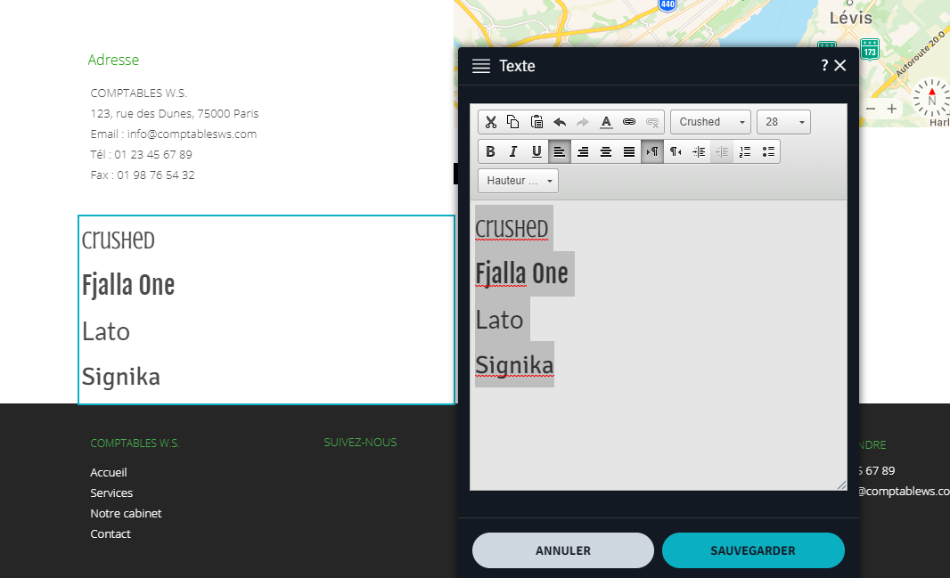
For titles, we recommend fonts like Crushed, Fjalla One, Lato, and Signika.
Find a font that represents your brand well. Use a font with personality for elements that must attract the readers’ attention.

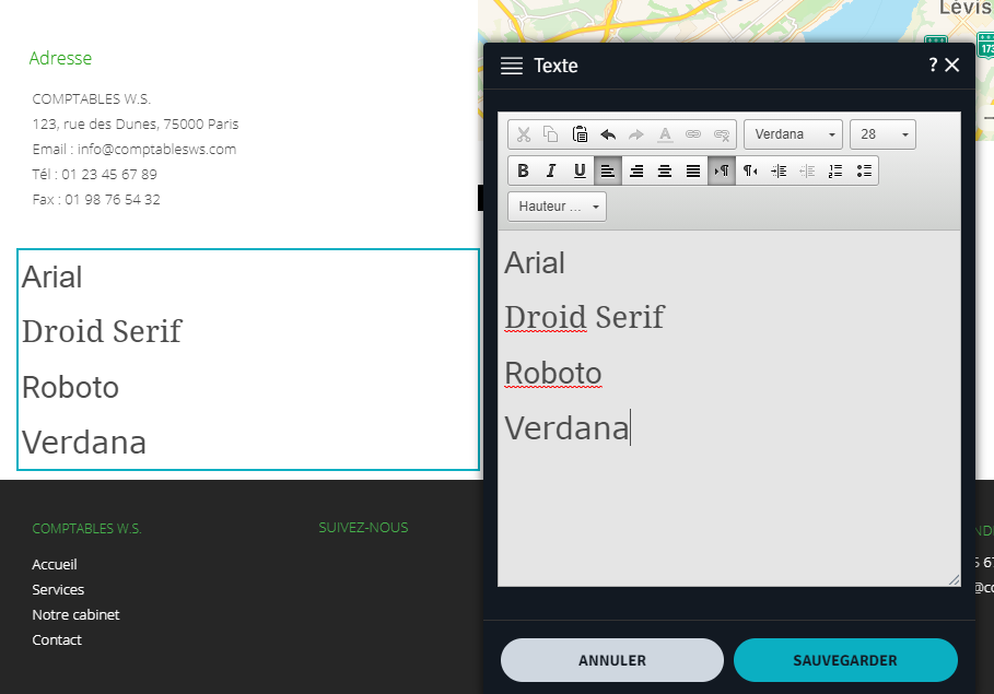
For texts, we recommend fonts like Arial, Droid Serif, Roboto or Verdana.
Find a font that will be easy to read and will not draw attention like for the titles. Whatever the number of lines, we need to be able to follow the text.

The WebSelf builder gives you access to more than sixty different fonts to create a website that will meet your expectations. They were chosen carefully because we wanted your texts to be readable. On the text editor, you only need to click on the Font tab to discover and try our suggestions. You can also click on the Styles tab located on the left of the builder to see which fonts were used and change them quickly. Once you have chosen your fonts, note them in your brand image guide not to forget them.
In conclusion, we hope that you will appreciate your website fonts better. It is indeed a more discreet element than the colors; however, fonts can help you create a professional-looking site. If you wish to read our other tips on typography and website design, you can learn how to harmonize different fonts on your site.