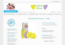
It is a little difficult to deal with a subject so evocative without falling into clichés: pictures of giant lice on the home page or the image of a child who is scratching are only a few examples of what we’ve seen over and over again! Adieu les poux has pushed the boundaries further and made the visit more enjoyable for everyone! Indeed, when the head of your child is filled with the little buggers, the last thing you want is to see a picture of the parasite nagging you in close-up!
An excellent use of our modules the site can be found all throughout the site. The comments page is the best example. It invites people to leave comments and vote on several issues that make the browsing experience not only interactive, but also useful for potential buyers!
The site is very intelligently built. It’s a fine example of web usability. Links to the online store are available at all relevant locations, like between customer’s testimonials for example, The visual & color palette is chosen with taste and well respected, even for the promotional items. Each page is well thought out and well-constructed, without unnecessary or irrelevant information. Another example of great webmastering from within the WebSelf community! Congratulations to the team of Adieu les poux!
