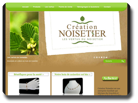
The design of the site is very well done, with beautiful photos and a template that fits well with both the sector of activity and the colors of the business. The default logo location on the left was used to insert a vivid image, while the default banner location was reserved for the insertion of the business’ logo. The webmaster uses well the WebSelf functions to vary the site’s appearance and goes a step further by interchanging the logo and banner’s default locations. By doing so, you can have more flexibility in the size of your logo. If you want your activity’s logo to be bigger on your site, this is a very good way to do this!
As for the site itself and its contents, again, it’s very well done! Images of buttons have been added to the site, such as the “acheter” (buy) button in the right section of the homepage and also all throughout the site. These buttons put the shop forward on the website, without taking up too much space or grabbing too much attention, like an animated banner would do. They also fully respect the design of the site and it’s style and color. If you wish to do so too, simply create an image and use the image module to insert it into your website. You can then add a click on the image and redirect to the shop of your site or any other page of your choice.
The homepage contains text modules that each redirect to other sections of the site, which is a great advantage in terms of user-friendly navigation and are straight to the point. This is an excellent Call-to-Action example
Another little trick used by the administrator of the site is to insert text modules at the bottom of his pages to create custom footers. This operation also adds a lot to the usability of the site, but also to the user experience. The terms of sale have been added to the home in this way, as well as the contact information of the company. Often, webmasters are struggling to find a location for these items. The way Creation Noisetier dealt with this is very professional and we highly recommend it. You will find the same type of home-made footers throughout the site, but the links will vary depending on the surrounding content. the Products(produits) page, for example, has links to the FAQ and testimonials sections, which are highly relevant in the context of this page. This type of footer also increases the internal links to your site, which can help your SEO.
Creation Noisetier is a great site, well-built and well organized. A great deal of thinking has been done when it came to building the site and it shows. A nice site to navigate is also a site with more chance of success. Keep the user experience in mind when you build your website and do not forget to learn from your fellow webmasters when they are good steps! Congratulations Designs Hazel for a very successful website!
