1. Align your content
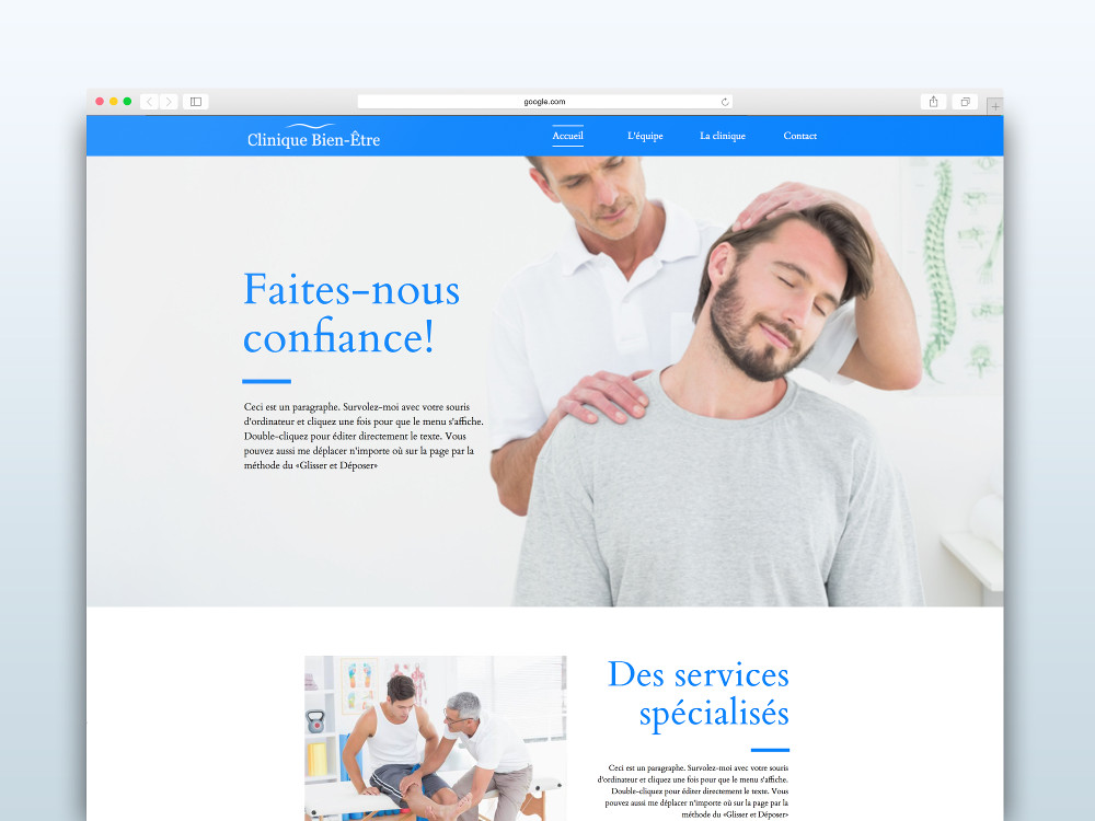
One small detail you need to pay attention and that is easy to solve is aligning your content. Webself’s editor has intelligent benchmarks so it’s very easy to align your content in the center or on another object. Simply drag the content you want to align to wherever you want to drop it, and when you are aligned with your other or in the center, a dotted line will appear. You can now drop your content. A well-aligned content will help you give a clear and clean look to your website.

2. Divide your content
On average, 20% of the text on your website is actually being read. Divide your text into small paragraphs and give them meaningful titles. Not only will this help your visitors find the information they are looking for more easily, but it will also make them want to browse through your whole content! When a text is divided into small paragraph, it seems much shorter than a continuous text and it is much more inviting to read. Also, feel free to add more content zones to lengthen your page if you need more space. Finally, make sure you divide your pages, so that the right information is found in the right place.
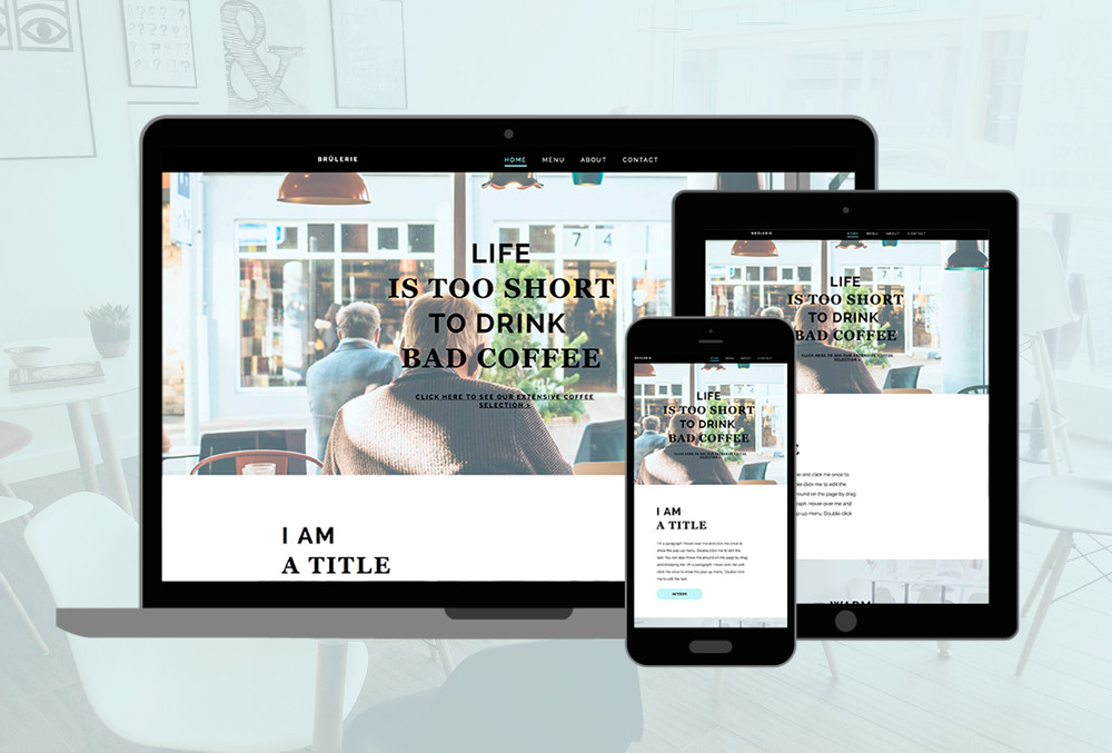
The Brûlerie template is a very good example of efficient division of content and alignment. The information is divided and aligned, which helps us better identify the information that is more relevant to us.

3. Leave white space
Don’t be afraid of leaving white spaces. White spaces provide visual breaks for your visitors and they help emphasize the important information. It is not necessary to add neon colors to capture the reader’s attention. By isolating and surrounding by white space the important information, you will get a better result and a more professional website.
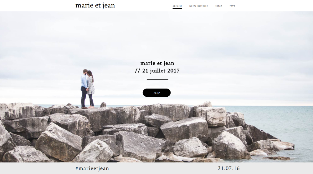
With the Wedding template, our eye is naturally drawn to important information because the page is full of white spaces, which gives a purified effect to the website.

4. Make sure your photos are optimized
The image optimization is not just to ensure they are of good quality. This is to ensure that they are relevant to your content, they are well-adjusted, they are good quality and are well referenced. You do not know where to start? Luckily for you, we have two articles on the subject that will certainly help you. Everything you need to know to optimize images and 6 tools for stunning pictures.
5. Only keep the necessary
To make sure you do not overload your website, only keep the necessary information.. If an item does not help understanding the information or consistency with your brand, it has no place on your website. You must purify your website to the maximum, while keeping the minimum necessary to capture the interest of your visitor in seconds. Focus on the good-quality images, large typography, or beautiful graphics and then publish your piece of art!
Ready to start? Create your free website.