1. Bright colors
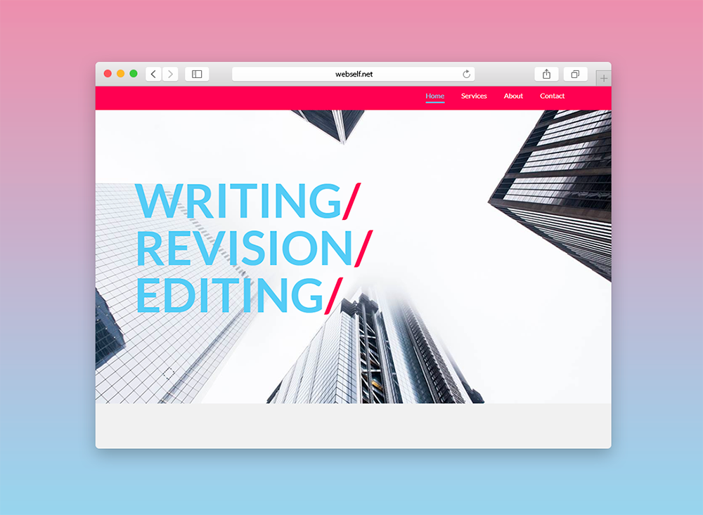
2018 is a colorful year! Forget the pastel colors and go for saturated colors and unusual contrasts. The Pantone color of the year 2018 is definitely showing that. After years of soft shades, Pantone came back in 2017 with Greenery and now Ultra Violet for 2018. Try using complementary color contrasts like yellow and purple, or coral and blue. The use of bright colors on your website and your brand image will help you stand out from all the other publications that on social networks.

2. Return of Retro
As we know, trends come and go, but they usually come back. In 2018, we are welcoming the return of geometric patterns and the contrast of pastel and electric colors inspired by the 80s. Bring out the flamboyant colors and dare the retro vibe for your website. The abstract patterns and vivid colors will reflect the vibrant personality of your business.
3. Bold typography
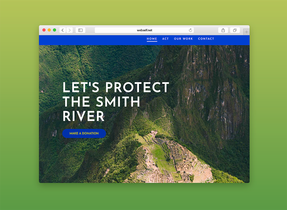
You have probably already read that sans-serif typographies are preferred on the web because it’s more readable. On the other hand, recently, fonts with more style or serif are making their entry into web design. Used for large titles, or in more modest paragraph text, a bold typography will certainly add interest to your website. Also, try adding spacing between the letters to add word breaks, the results will certainly be interesting! However, the most important criterion will always be readability and accessibility. Always make sure the customer has a good understanding of your content.
4. Realistic images
Snapshot images from the image bank days are over. For your website, use realistic images that tell a story, and bring a more human effect. An image bank that offers pretty realistic images is Unsplash: they offer beautiful photos for free. If you do have the budget though, we definitely recommend hiring a professional photographer, since original quality photos are always the best way to go!

How will you design your website in 2018?