Balance
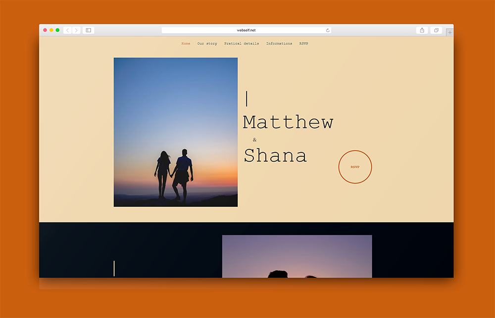
Balance is one of the most important principles in design. It includes making sure there is balance in your website’s layout. This does not mean that it must be perfectly symmetrical. It means you should layout your site in a way that is visually appealing. To balance your website well, you need to know the visual weight of each image. An image that has many details will weigh more than a very simple image, or a small amount of text. The weight of an image is defined by its size, color, and the amount of visual information it contains. The bigger, darker and more detailed it is, the heavier it is for the eye. For example, the Wedding template. You will notice that the home page is not symmetrical, but the layout is balanced. With the text and a button on one side, and a relatively simple image on the other, we can see that it is visually harmonious.

Contrast
Contrast is another important design principle when designing your website. If you put different shades of blue on your site and have long paragraphs of text, it will lack contrast. Have some fun with contrasting colors, or different font sizes for titles and text. Experiment with extravagant font styles and exaggerate the size of your titles keeping the text simple by using a font like Lato.
It is also important to think about the amount of white space on your website. It may be tempting to fill your web pages with a lot of information; however, that is not the best idea - do not be afraid of white space. If you add a very detailed image to your website, leave some blank space around it as that contrast will make the image stand out. The Sports Academy design is a great example of contrast. The oversized white and yellow font of the title makes a nice contrast with the very dark image in the background.
Hierarchy
The third design principle is the hierarchy principle. Obviously, you need to make sure your visitors can easily navigate through your site; therefore, you have to organize the content properly. Before you start, if you have not already, take some time to analyze the content on your website, to rank the content’s importance. If not, it is very important to start with that. Think about the information you absolutely want your visitors to see first. Once you have determined that, you can easily create a hierarchy on your site.
There are several ways to make an element on your site stand out. First, you need to know how a user navigates a site. In general, users follow the "F pattern" to read a website, which means that they will read your content following the shape of the letter F with their eyes: starting at the top left, then moving to the right before going down a little. So, if you rely on this pattern, your most important item should be at the top left of your home page. Usually, we find the company logo there. Then, by moving your eyes a little to the right, you should see the navigation menu, which happens to be another crucial element. After that, put your content below keeping in mind that the user will read the information from left to right and then down.
Other ways to draw attention to an important element on your site is to leave a lot of empty space around it or increase its size.

Consistency
The last but certainly not the least principle is consistency/unity. The layout of your website must be on the whole consistent - all pages must look similar. To get there, start by choosing your palette based on your logo, if possible. A good tool for creating palettes is Coolors, where you have an infinite amount of palettes to choose from. Keep looking until you are satisfied. If you are more pragmatic, you can also import a photo, of your logo let’s say and design your site based on the colors in the image. When creating your color palette, make sure various elements on your site are contrasting colors. For example, more neutral color for backgrounds, contrasting color for text, and an accent color for buttons and other graphics. A good color palette does not consist of similar colors, but complementary colors. Variety is your friend!
Another important element to consider is the number of fonts used. We think that two are optimal to use - one for paragraphs and one for titles. This will create some contrast without having an eclectic effect, which could happen with 3 or more fonts.
To apply your chosen styles to your site, use the "Styles" panel. You only have to set the style of each element once on your site. Every time you add a new element to your site, the style is already set! It's a great way to keep continuity between your pages.
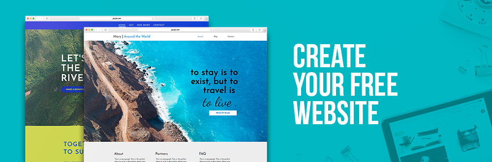
Now that you know a little more about what makes a good design, what are you waiting for? Put it into action! Create your website today!