Choose the Perfect Template for Your Online Résumé
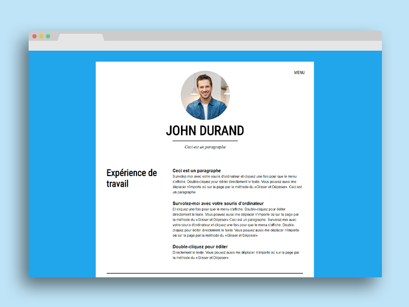
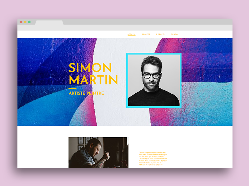
To start with, the first step you must follow when creating a WebSelf website is to choose a template, a basic model. We have more than 200 different templates and we know it might be hard to choose only just one. Although all our templates can become your online CV, some of them were made especially to help you present yourself. You can find them under the Personal category. For example, we have this one and this one too.

You need to have an idea of what you want to have on your online résumé before making a final choice. Do you want to add your school curriculum and experiences? Do you wish to include recommendations or a portfolio? As mentioned above, all of WebSelf’s templates can become your online CV. You could do a one-page website or a website with 10 different pages if it is what you need. Keep in mind that the final result must look professional, be easy to use, and suit your personality.

Use Relevant Text
As it is the case for a traditional résumé, there are some rules to follow to be seen as an interesting candidate by potential employers. First, do not forget to add a title. This can be as simple as your name. On another note, it is important to choose a domain name related to your website since it will help the indexing on search engines and will help you look professional. Furthermore, separate your content into different categories to ease its readability. You can also add a brief introduction at the top and then have sections about your studies, experiences, recommendations, etc. Make it short and sweet too. Often recruiters only have a few minutes to read your résumé.
It is also recommended to use action verbs when you talk about what you have done in the past. Use words like design, create, lead, manage or coordinate, since they are more dynamic (design an advertising document, organize a photoshoot, manage a project) than the verbs to do or to make (make an advertising document, do a photoshoot, do a project). Otherwise, it is important to leave no grammar or spelling mistakes on your online résumé. It would greatly harm your credibility.
Use Relevant Elements
As we mentioned in our article about the importance of a website coherence, each element that you add on a website must be there for a reason. It is even more valid for an online CV. You probably do not want your website to be visually too heavy or long to load, right? First, if you want pictures on your website, choose high-quality over quantity. The JPEG format can be a good choice if you do not need transparency. There are also many image banks that you can check if you are looking for professional pictures. If you are looking to have a place where to put examples of what you can do, you could add them on another page to not harm the loading time of your main page. You can also add videos on your website if you want.
Moreover, do not forget to make an accessible website, which means to be both easy to use and attractive. To achieve this, we suggest you use a maximum of 5 colors on your website, including pale and darker colors to create contrasts. It will then be easier to read your texts. Make sure to use the same colors for the same kinds of elements to create a harmonious result. For example, all your buttons or titles could be of a color that catches people’s attention, whereas your texts could be in black. Do not use more than two different fonts too.
Do Not Forget Your Contact Information
Do not forget to add a place where we have access to your contact information if you want to be contacted by potential employers. You can use a contact form or put directly your phone number or your email in the website header or the footer. It is important to find easily this information. Why not add a link to your LinkedIn page if you have one? We recommend you only link your online résumé with your professional social media accounts.
In conclusion, you can surely check freelancers' websites to help you create a more attractive CV. Find what distinguishes yourself from other candidates and then create both a beautiful and professional website. Why not take this opportunity to include recommendations from past colleagues or employers directly on your online résumé? This would surely interest recruiters!